Sheridan Fruit Co.
A Rebrand of a Local Portland Business
Re-envisioning a local brand to modernize their identity and make it more relevant to the business.
Sheridan Fruit Company is a local gem of a grocery store that brings knowledge, curated brands, and customer satisfaction to the forefront of their business. Their farm-fresh produce, longevity as a 100-year-old business, and down-to-Earth local feel sets them apart from their competitors, and I want their redesign to encompass the unforgettable experience of shopping here. The storefront maintains that old school, authentic, local Portland feel and represents a part of the community’s heritage. their customers attest to high quality products, outstanding service, and a fantastic selection of curated food items. The main target audience for Sheridan’s is local chefs, restaurateurs, and fairly experienced cooks/foodies who are looking for that top-rated farmer’s market quality without being too high-end or gourmet.
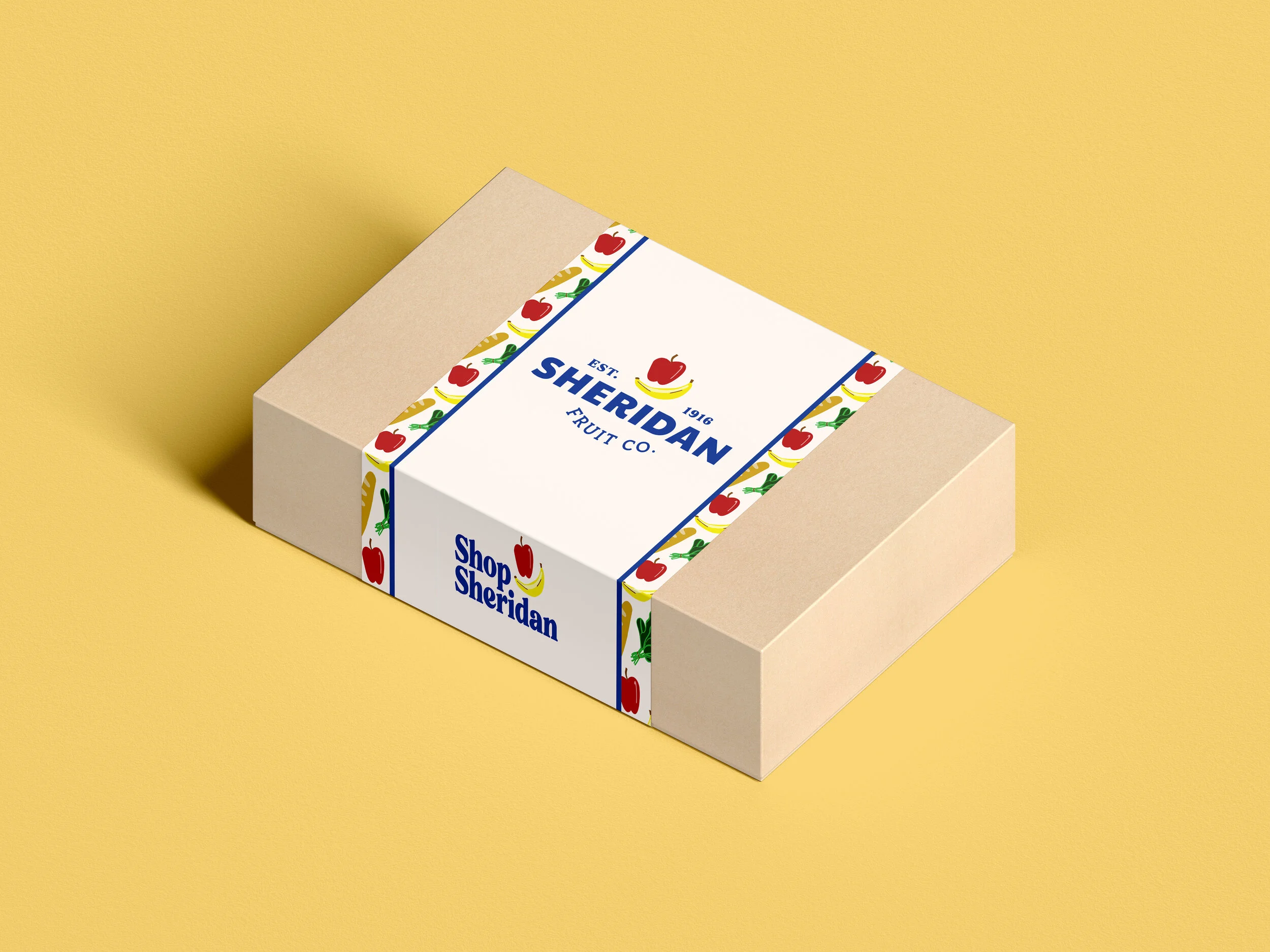
The challenge of this project was to re-envision the brand’s logomark, business cards, a letterhead/envelope, a grocery tote bag, a staff t-shirt, a fruit-of-the month box, and an apron. My goal was for customers to experience the brand in it’s authenticity and heritage, while speaking to that community-focused, high-quality Portland institution that is Sheridan Fruit Co.