In Living Color
A Color-Curated Art Exhibition for SFMOMA
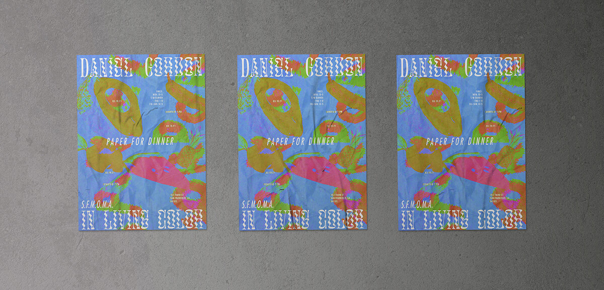
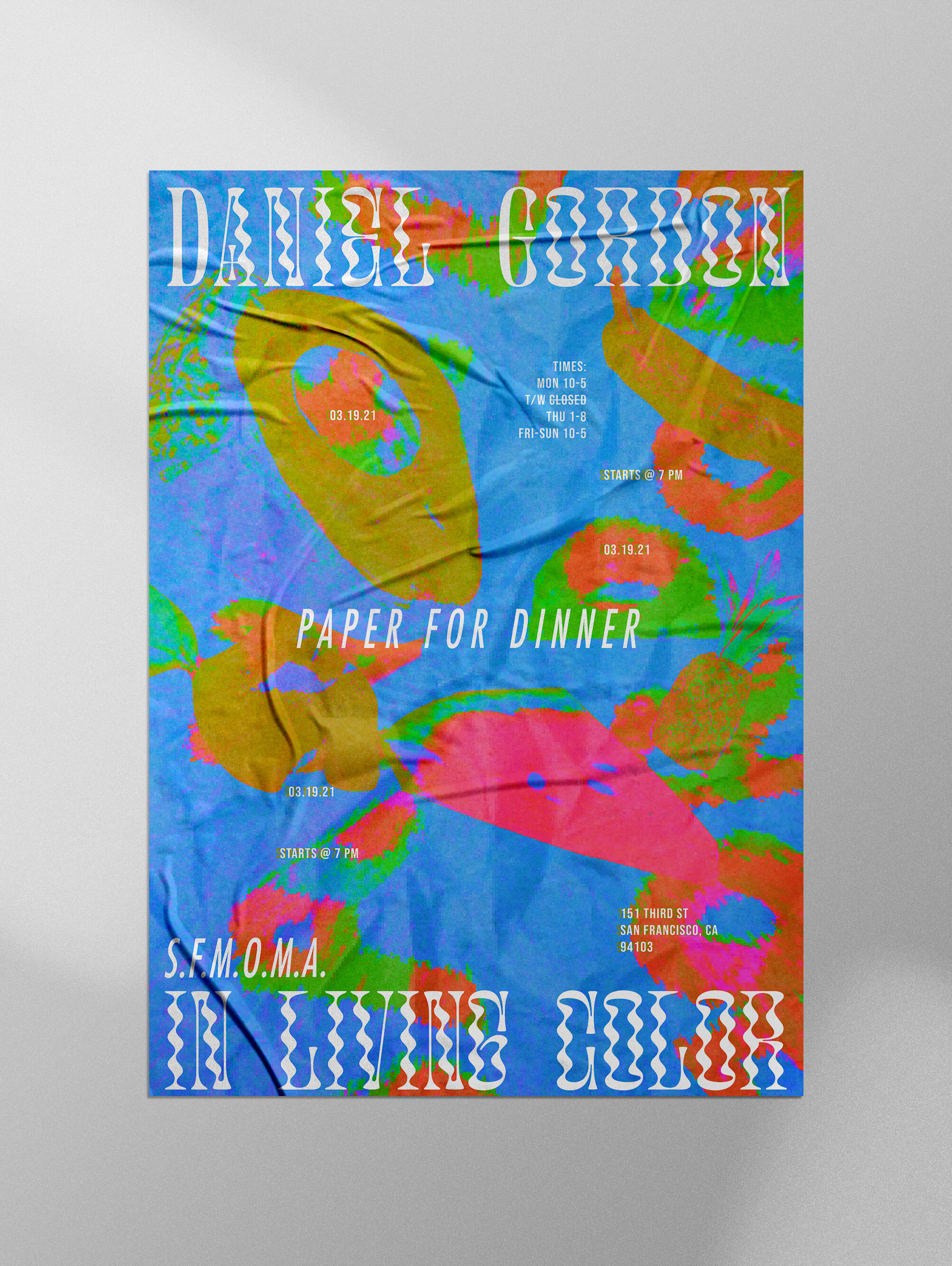
Branding for an art exhibition opening at the SFMOMA in Spring 2021.
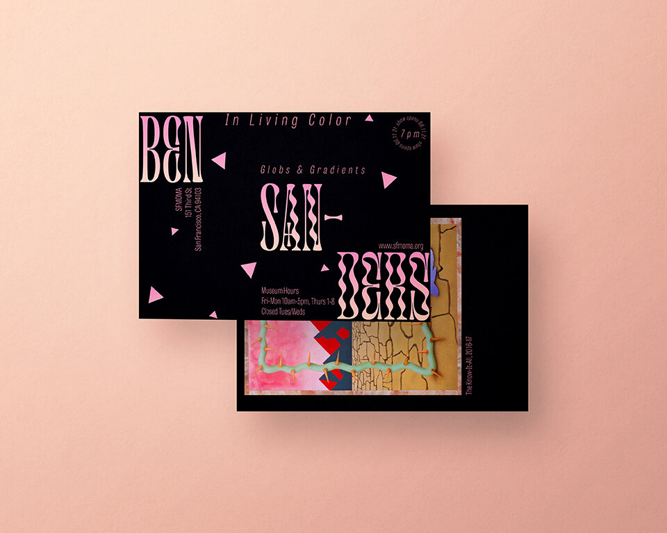
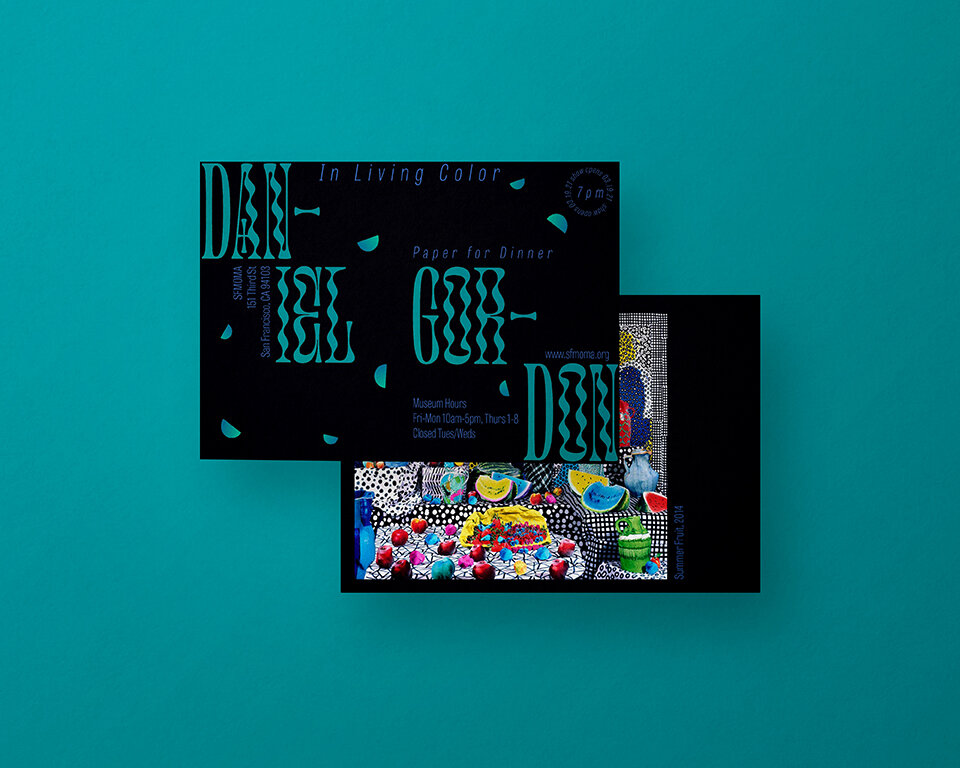
“In Living Color” is a celebration of hue, saturation, and the means in which selected artists utilize color. Whether it be the deeply saturated maximalist approach of Daniel Gordon’s still life pieces or the enticing local color of David Hockney’s swimming pools, each artist uses color in a uniquely evocative way. Throughout the course of 2021’s spring to summer seasons, the seasons where our cold, dark world evaporates into a stunning display of color as the sun shines brighter and flowers begin to bloom, we will be exalting the simplicity of color in our everyday lives. After a year stuck inside, we hope to see the world in technicolor, with its art, flavor, and culture seeping back into our lives. Our artists represent the “full bloom” of color in our often grayscale mundane routine: the fruit on our table, the yards we pass by, the people we love, the food we eat, and the tools and toys we use. So let’s get messy with color and hail the visible spectrum of light to which we seek to give meaning.
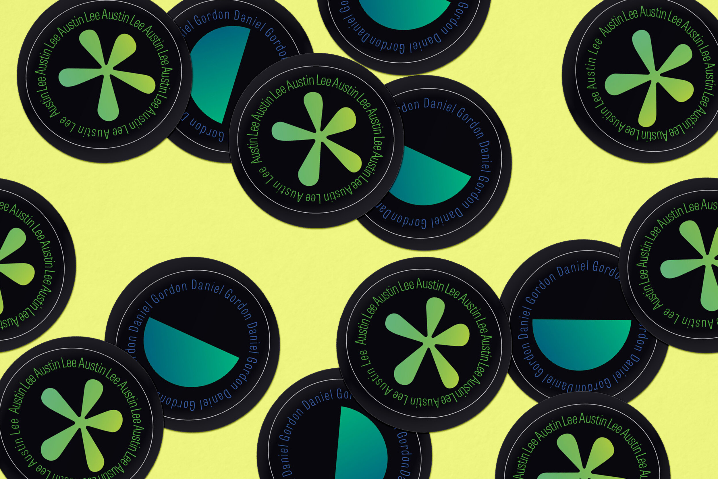
The goal for this project was curate a group of different artists and designing an identity for the exhibition. The set deliverables were six artist postcards, a calendar overview poster, a sticker sheet, an instagram post, a primary artist poster for the leading artist, and a booklet of the curated art.
I focused heavily on using expressive typography, vibrant gradients, and specific shapes to represent each artist in the show.